
Raw data is everywhere — in spreadsheets, databases, app dashboards, and automated reports. But rows of numbers rarely explain themselves on their own. Data visualization software bridges that gap by converting raw figures into charts, graphs, maps, and interactive dashboards that people can actually understand and act on quickly.
Choosing the right tool is not simply a matter of picking the most popular name. The best option depends on your data size, your audience’s technical level, and what kind of decisions those visuals need to support. This guide explains what data visualization software does, breaks down the main tool types, and walks through real examples so you can find the best fit for your situation.
What Data Visualization Software Actually Does
At its core, data visualization software takes structured data — whether from a spreadsheet, a database, or a live API feed — and renders it as a visual format. That visual might be a simple bar chart comparing monthly sales figures, or a complex geographic heat map showing customer density by region.
Turning Numbers Into Decisions
The human brain processes visuals far faster than text or tables. A well-built chart can reveal a trend in seconds that would take minutes to spot in raw data. Data visualization software makes this translation automatic and repeatable. When a sales manager opens a dashboard each morning, they see immediately whether revenue is on track, which region is underperforming, and where inventory is running low — without running a single manual calculation.
Where Visualization Fits in an Analytics Workflow
Data visualization is not a standalone task. It sits at the end of a data workflow: data is first collected, then cleaned and structured, then analyzed, and finally visualized for reporting or decision-making. Some tools, like business intelligence platforms, also handle parts of the analysis stage by connecting directly to databases and performing aggregations automatically.
Core Features That Matter Most
Not all visualization tools offer the same capabilities. Understanding which features matter most helps you avoid paying for complexity you do not need — or settling for a tool that cannot grow with your team.
Dashboards and Live Data Connections
A dashboard is a single screen that shows several charts or KPIs at once, updated on a schedule or in real time. The most useful dashboards connect to live data sources — a database, a Google Sheet, a CRM, or an API — so they refresh automatically rather than requiring a manual export each time.
Filters, Drill-Downs, and Collaboration
Interactive filters let viewers narrow a chart to a specific date range, region, or product category without editing the underlying data. Drill-down capability lets a viewer click a summary bar to see the breakdown behind it. Collaboration features — shared links, commenting, role-based access — matter when reports go to multiple stakeholders with different permission levels.
Export Options
Most teams eventually need to share data outside the tool itself: a PDF for a board report, a PNG for a slide deck, or a CSV for a downstream system. Good visualization tools export cleanly without losing formatting or interactivity.
Main Types of Data Visualization Tools
Data visualization tools span a wide range — from spreadsheets already on most computers to specialized platforms built for enterprise-scale reporting. Understanding the categories helps you match the tool to the problem.
Spreadsheet Tools
Microsoft Excel and Google Sheets are the most widely used starting points. They handle basic charts — bar, line, pie, scatter — and work well for smaller datasets and individual or small-team use. The main limitation is scale: they slow down with large datasets and lack the interactivity of dedicated platforms.
Business Intelligence Platforms
BI platforms like Tableau, Microsoft Power BI, and Qlik Sense connect to multiple data sources simultaneously, support complex calculated fields, and publish shareable dashboards to entire organizations. They are built for ongoing, repeatable reporting rather than one-off charts.
Code-Based Libraries
Developers working in Python or JavaScript often use libraries like Matplotlib, Plotly, or D3.js to build custom charts embedded in web apps or data science notebooks. These offer maximum flexibility but require programming knowledge to use effectively.
Specialized and Free Online Tools
Tools like Google Looker Studio (free), Datawrapper, and Flourish fill the gap between spreadsheets and full BI platforms. They are easier to learn than Tableau, more powerful than Excel charts, and well suited to marketing teams, journalists, and small businesses.
Popular Tools and What They Are Best For
- Microsoft Excel: Best for individual analysts working with datasets under 100,000 rows, quick ad hoc reports, and environments where no specialized software is available.
- Google Sheets: Similar to Excel but fully cloud-based, making it ideal for collaborative teams who share and co-edit data in real time.
- Tableau: The industry standard for large-scale BI. Strong drag-and-drop interface, excellent visual polish, and connects to virtually any data source. Licensing can be expensive for small teams.
- Microsoft Power BI: Deep integration with Microsoft 365 and Azure. Competitive pricing for organizations already in the Microsoft ecosystem. Steeper learning curve than Looker Studio but more powerful for SQL-heavy environments.
- Google Looker Studio: Free, browser-based, and integrates natively with Google Analytics, Google Ads, and Google Sheets. A strong choice for marketing and content reporting.
- D3.js: A JavaScript library for fully custom, interactive web-based charts. Maximum control, but requires front-end development skills and significant build time.
- Plotly: Available for Python and JavaScript. Popular in data science for building interactive charts inside Jupyter notebooks or standalone web apps.
Examples of Visualizations in Real Use
Understanding tool categories becomes clearer with concrete examples of what each visualization type actually communicates in practice.
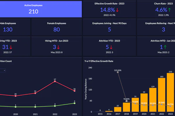
- Sales dashboard: A bar chart showing monthly revenue by product line, a KPI card comparing actual versus target, and a line chart tracking new customer acquisition — all on one screen for a sales director’s daily review in Tableau or Power BI.
- Website traffic report: A Google Looker Studio report pulling from Google Analytics, showing sessions by channel, bounce rate trends, and top landing pages over the past 30 days, refreshed automatically each morning.
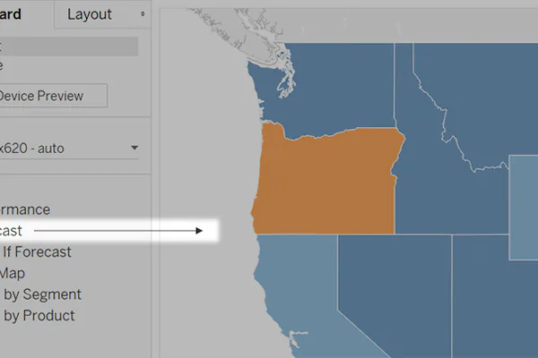
- Geographic map: A choropleth map coloring countries or regions by sales volume, making it immediately obvious where the business is strongest and where gaps exist — built in Tableau or Plotly.
- Trend chart: A line chart in Excel or Google Sheets plotting weekly support ticket volume, helping a customer service manager spot seasonal spikes before they overwhelm the team.
How to Choose the Right Software
The right tool is the one that matches your actual situation, not the one with the longest feature list. Three factors narrow the decision quickly.
Budget and Team Skill Level
Tableau and Power BI require licensing fees and time investment to learn properly. For a solo marketer or a small team, starting with Google Looker Studio or Datawrapper saves money and produces results faster. If your team includes developers, code-based libraries offer more flexibility without per-seat subscription fees.
Data Sources and Sharing Requirements
Ask where your data lives and where your reports need to go. If all your data is in Google Sheets and your reports go into Google Slides, Looker Studio is a natural fit. If your data is in a SQL database and your organization runs on Microsoft Teams, Power BI connects both cleanly with minimal setup.
Scalability
A spreadsheet chart is fine today but may not be practical when data grows to millions of rows or when ten departments need different filtered views of the same report. Factor in where you expect data volume and team size to be in the next 12 to 24 months before committing to a platform.
Common Mistakes When Building Visual Reports
Even powerful software produces poor results when used carelessly. These are the most common errors and how to fix them.
- Cluttered dashboards: Placing 20 charts on one screen overwhelms rather than informs. Focus each dashboard on 5 to 8 key metrics that matter to one specific decision-maker or role.
- Wrong chart type: Using a pie chart to compare 12 categories, or a line chart for unordered data, distorts interpretation. Match the chart type to the relationship you are showing: comparison, composition, trend, or distribution.
- Misleading axes: A y-axis that does not start at zero can make a small change look dramatic. Always label axes clearly and use consistent scales across related charts.
- No context or benchmarks: A number without a benchmark is meaningless. Show actual versus target, current versus prior period, or rank within a group so viewers know whether what they are seeing is positive or negative.
- Style over clarity: Fancy color gradients, 3D effects, and animated transitions can obscure the data point they are meant to highlight. Clarity comes first; aesthetics come second.
When Simple Tools Are Enough — and When They Are Not
A well-structured Excel chart shared via email can solve the reporting need for a team of five that reviews data monthly. Not every situation calls for a dedicated BI platform. Simple tools are enough when data updates are infrequent, the audience is small and comfortable with spreadsheets, or the report answers one specific question rather than an ongoing monitoring need.
Dedicated visualization platforms start to earn their cost when dashboards need to refresh automatically from live databases, multiple teams need different filtered views of the same underlying data, data volumes exceed what spreadsheets handle reliably, or non-technical stakeholders need self-serve reporting without IT involvement each time.
Conclusion
Data visualization software is not a luxury reserved for large enterprises with dedicated data science teams. From a free Looker Studio dashboard to an enterprise Tableau deployment, there is a tool for every budget, skill level, and data size. The key is matching the tool to the actual problem: who needs to see the data, how often it changes, where it comes from, and what decision it needs to support. Start with the simplest option that meets those requirements, and scale up only when the limits of that tool become visible.